How to Use Color Theory in Street Photography: A Comprehensive Guide
As the sun dips below the horizon, painting the sky in a breathtaking array of oranges, pinks, and purples, a street photographer waits patiently at a busy intersection. She's not just waiting for any moment, but for that perfect alignment of color and composition that will turn an ordinary street scene into an extraordinary photograph. This is the power of color in street photography – the ability to transform the mundane into the magnificent.
Color is more than just a visual element in photography; it's a language that speaks directly to our emotions and perceptions. For street photographers, understanding and applying color theory can be the difference between a good photograph and a great one. In this comprehensive guide, we'll explore how to harness the power of color theory to create more impactful and visually striking street photographs.
Whether you're a beginner looking to understand the basics or an experienced photographer aiming to refine your color skills, this article will provide you with valuable insights and practical techniques to enhance your street photography.
Understanding the Basics of Color Theory
Before we dive into the bustling streets with our cameras, let's take a moment to understand the language of color. Color theory isn't just for painters and graphic designers; it's a powerful tool in the street photographer's kit.
The Color Wheel: Your Visual Compass
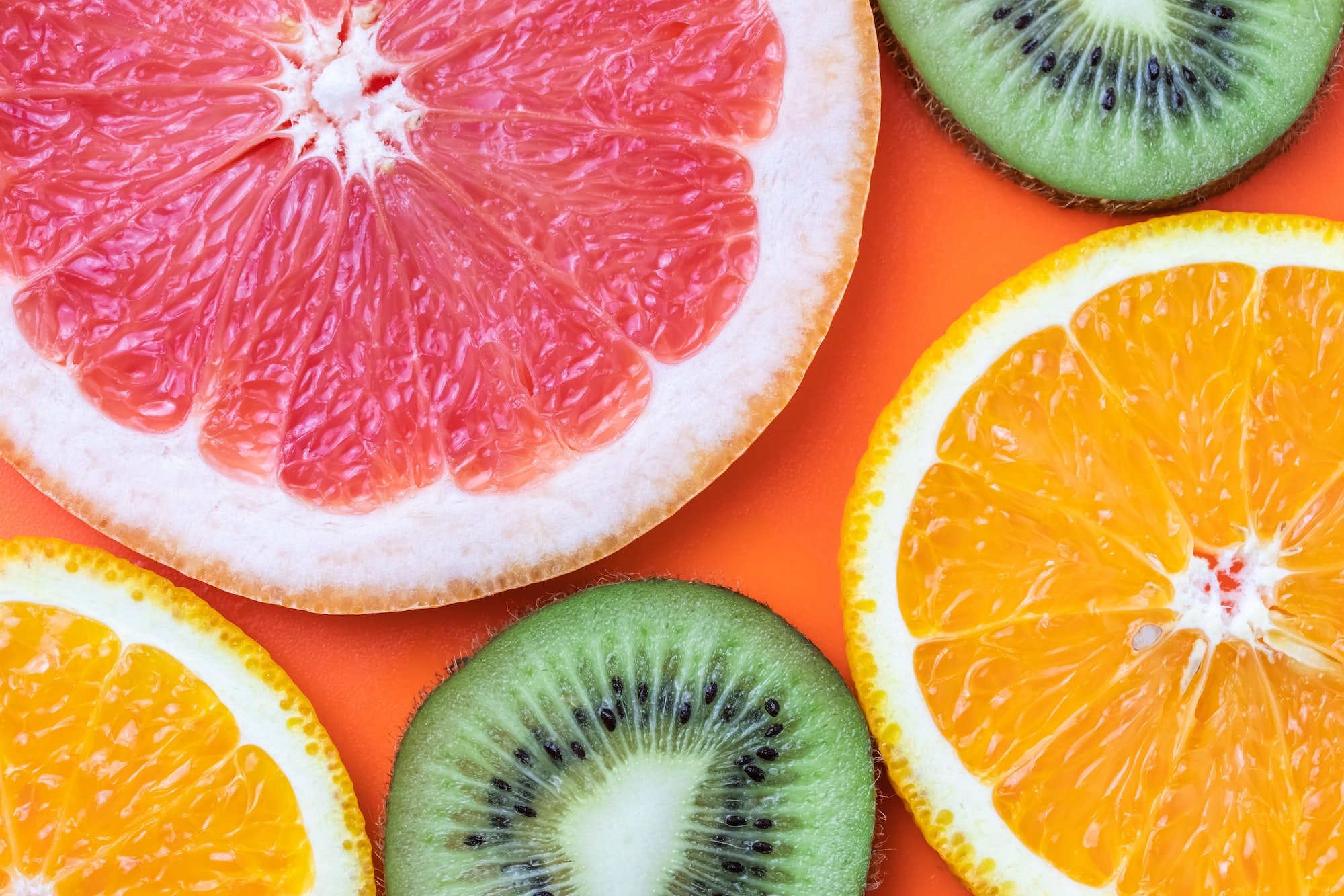
Imagine you're standing in the middle of a vibrant market. Around you, fruits and vegetables create a natural color wheel – the deep reds of tomatoes, the sunny yellows of lemons, and the cool greens of cucumbers. This real-world color wheel is not so different from the one artists and designers use.
The color wheel is built on three primary colors: red, blue, and yellow. These are the building blocks from which all other colors are created. Mix these primaries, and you get secondary colors: green, orange, and purple. Go a step further, blending primary and secondary colors, and you arrive at tertiary colors like yellow-orange or blue-green.
Understanding this wheel is like having a map of the color world. It helps you navigate the visual relationships between colors and predict how they'll interact in your photographs.
Color Harmonies: The Music of Visual Composition
Now, imagine you're at a street festival. The colorful costumes of performers create a visual symphony. This harmony of colors isn't accidental – it's based on specific relationships on the color wheel.
Complementary colors, like the red and green of a street performer's outfit, sit opposite each other on the wheel. They create a vibrant, eye-catching contrast. Analogous colors, such as the various shades of blue in a storefront display, sit next to each other on the wheel and create a sense of harmony and cohesion.
These color relationships are your tools for creating mood and drawing attention in your street photography. By understanding them, you can begin to see the streets not just as a collection of random colors, but as a palette waiting to be composed.
Applying Color Theory in Street Photography
Let's hit the streets and see how we can apply these color principles in real-world situations.
The Power of Complementary Colors
Picture this: You're walking down a busy city street when you spot a woman in a vivid red coat standing against a green wall. The contrast is striking, almost electric. This is the power of complementary colors in action.
Complementary colors create strong visual interest because they provide maximum contrast. In street photography, you can use this to make your subject pop out from the background. But be cautious – overuse can lead to images that feel chaotic or overwhelming.
A street photographer I know, let's call him Tom, once spent an entire day in New York City photographing only scenes with strong complementary color contrasts. He came away with a series of images that practically vibrated with energy – yellow taxis against purple twilight skies, orange construction barriers against blue storefronts. The key, Tom found, was to use the complementary colors to guide the viewer's eye to the main subject of each photograph.
The Harmony of Analogous Colors
Now, let's shift gears. Imagine you're photographing during the golden hour, that magical time just before sunset when the world is bathed in warm light. The streets are awash in a palette of yellows, oranges, and reds – these are analogous colors, and they create a sense of harmony and cohesion in your images.
Analogous color schemes can be powerful for setting a mood or creating a sense of place. A photograph of a bustling Chinatown street, with its red lanterns, gold signage, and orange storefronts, uses an analogous color scheme to convey the warmth and energy of the neighborhood.
Sarah, a street photographer based in San Francisco, uses analogous color schemes to create visual stories about different neighborhoods. Her photographs of the financial district, all cool blues and greys, convey a very different mood than her shots of the colorful Mission district, with its warm yellows and oranges.
Monochromatic Magic
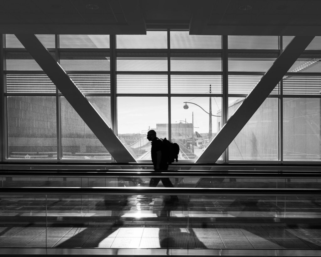
On a foggy morning, the world can seem to be painted in shades of grey. This is a perfect opportunity to explore monochromatic color schemes in your street photography. A monochromatic image uses variations of a single color, creating a sense of harmony and emphasizing texture and form.
I once saw a stunning street photograph of a rainy day in London. The entire image was a study in blue – from the deep navy of wet asphalt to the pale blue-grey of the misty sky. In the center, a figure in a light blue raincoat provided the focal point. The monochromatic scheme perfectly captured the mood of a rainy London day.
The Psychology of Color in Street Photography
Colors don't just look pretty – they speak to us on an emotional level. Understanding the psychological impact of different colors can help you create more powerful, emotive street photographs.
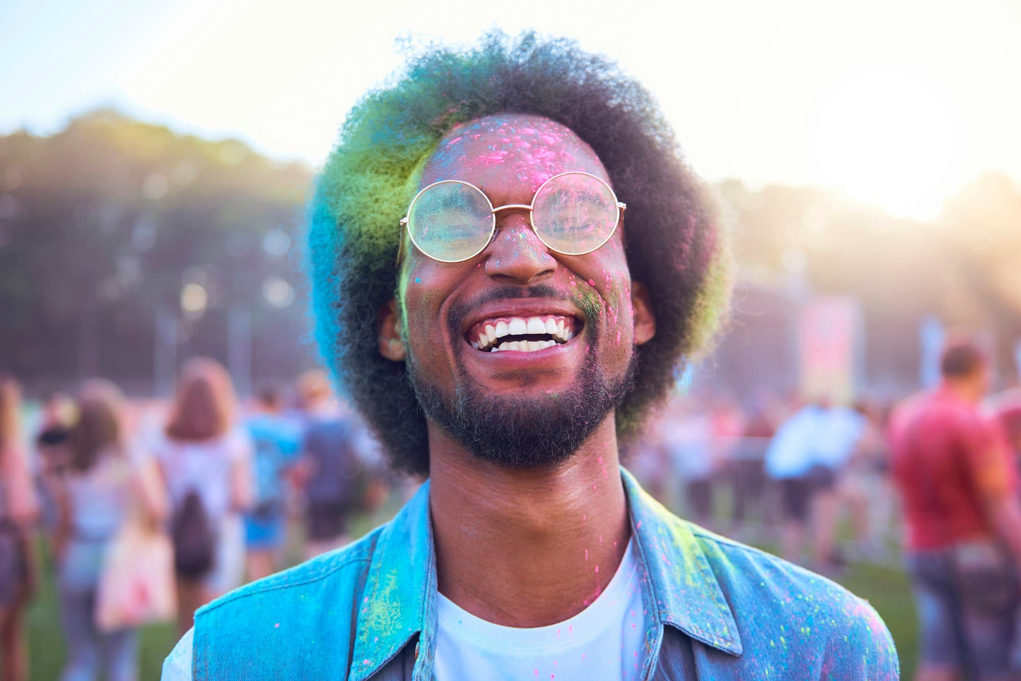
Red: The Color of Passion and Energy
Red is a bold, attention-grabbing color. It signifies energy, passion, and sometimes danger. In street photography, red can be used to draw the eye to key elements in your frame.
I once saw a photograph of a bustling Indian market that used red brilliantly. The image was a riot of colors, but your eye was immediately drawn to a vendor in a bright red sari. The red acted like a beacon, guiding the viewer through the chaotic scene.
However, be cautious with red. Its power means it can easily overwhelm an image if overused. Use it as an accent color for maximum impact.
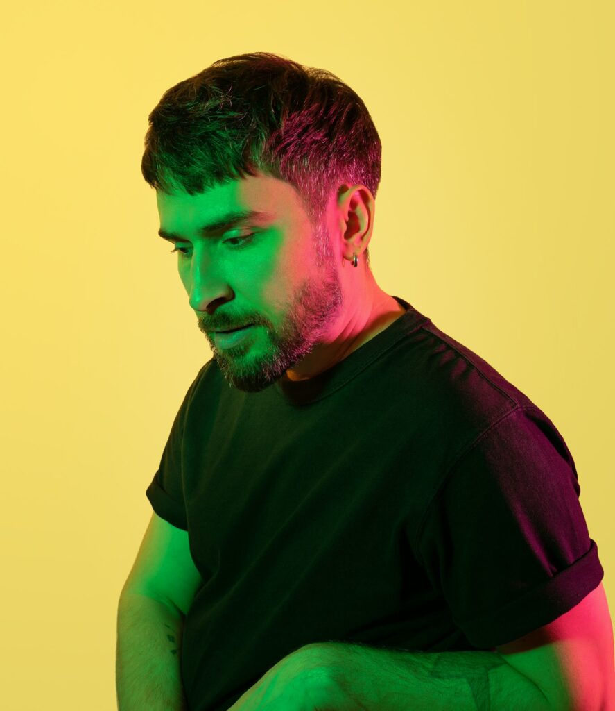
Blue: Calmness and Contemplation
Blue is associated with calmness, stability, and trust. It can be used to create a sense of serenity or melancholy in your images. Think of how different a street scene feels when photographed on a clear, blue-sky day versus a grey, overcast one.
A photographer friend once showed me a series of street portraits he'd taken in a seaside town. Many of his subjects were framed against the blue sea or sky, and the overall effect was one of tranquility and contemplation. The blue backdrop seemed to encourage a certain introspective quality in his subjects.
Yellow: The Color of Optimism
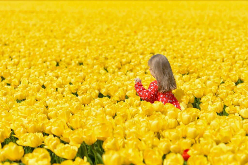
Yellow represents happiness, optimism, and warmth. It's a color that can add a cheerful element to your street scenes. However, like red, it's a color that demands attention and can easily dominate a frame if you're not careful.
I once saw a delightful street photograph taken on a rainy day. The image was mostly grey – wet streets, cloudy sky – but in the center was a child in a bright yellow raincoat, jumping in a puddle. The yellow raincoat was like a little burst of sunshine in the grey scene, perfectly capturing a moment of joy.
Techniques for Capturing and Enhancing Color in Street Photography
Now that we understand the theory, let's talk about some practical techniques for capturing and enhancing color in your street photography.
Shooting Techniques
When it comes to capturing color accurately, your camera's white balance settings are crucial. Auto white balance can be convenient, but it doesn't always get it right, especially in mixed lighting situations common in street photography.
I remember a workshop I attended where the instructor took us to a neon-lit street at night. He showed us how to use custom white balance to capture the true vibrancy of the neon signs, rather than letting the camera neutralize these exciting colors.
Another important technique is to shoot in RAW format. This gives you much more flexibility to adjust colors in post-processing without losing image quality. It's like having a digital negative that you can develop in multiple ways.
Post-Processing Techniques
In the digital darkroom, tools like the HSL (Hue, Saturation, Luminance) panel in editing software allow you to target and adjust specific colors in your image. This can be powerful for emphasizing certain elements or creating a particular color mood.
A street photographer I admire, Lisa, uses split-toning in her post-processing to add subtle color to the highlights and shadows of her black and white street images. The result is a unique color palette that's become her signature style.
Challenges and Solutions in Color Street Photography
Street photography presents unique challenges when it comes to color. Let's look at some common issues and how to address them.
Dealing with Mixed Lighting
One of the biggest challenges in street photography is dealing with mixed lighting situations. You might have warm streetlights, cool moonlight, and the green glow of neon all in the same scene.
I once watched a skilled street photographer work in such a situation. Instead of fighting the mixed lighting, he embraced it, using the different color temperatures to create depth and interest in his image. The warm-lit foreground contrasted beautifully with the cool-toned background, creating a sense of dimensionality.
Handling Harsh Midday Light
Harsh midday sun can wash out colors and create unflattering shadows. But it can also be an opportunity for striking high-contrast images.
A photographer I know specializes in high-noon street photography. She looks for pockets of shade that create interesting patterns and uses the harsh light to create dramatic silhouettes against colorful backgrounds. Her images have a graphic, almost abstract quality that turns the challenge of midday light into a unique style.
Developing Your Color Style in Street Photography
As you continue to explore color in your street photography, you'll likely begin to develop your own unique color style. This might involve favoring certain color combinations, or consistently using color in a particular way to convey mood or tell stories.
Take time to analyze your favorite images – both your own and those of photographers you admire. What color palettes do you find yourself drawn to? Do you prefer bold, saturated colors or more muted tones? Do you often use color as a primary subject, or more as a supporting element in your compositions?
Remember, developing your style is a journey, not a destination. Allow your approach to color to evolve as you grow as a photographer.
To End Things
Color is a powerful tool in the street photographer's arsenal. By understanding color theory and applying it thoughtfully to your work, you can create more impactful, emotive, and visually striking street photographs.
Remember the patient photographer we met at the beginning of this article? As the sky erupts into a finale of color, she spots her moment – a businessman in a blue suit crossing the street, perfectly framed against the warm-hued sky. Click. She's captured a moment where color, composition, and timing align to tell a story of contrast – the cool, corporate world against the warm, natural beauty of the sunset.
This is the magic of color in street photography. It's not just about capturing what you see, but about using color to convey what you feel – the energy of a city, the mood of a moment, the character of a place.
As you continue your journey in street photography, keep exploring, keep experimenting with color. And most importantly, keep shooting. The streets are an ever-changing canvas of color waiting for you to compose your next masterpiece.