Quick Summary
Master the art of monochrome street photography. Learn when to choose black and white over color, processing techniques, and how to develop your unique vision in the timeless medium.
Black and White Street Photography: When, Why, and How
Black and White Street Photography: When, Why, and How
I spent my first year in street photography desperately trying to capture vibrant colors—the red of a passing bus, the yellow of a taxi, the neon rainbow of Times Square. Then I discovered the work of Daido Moriyama, and everything changed. His high-contrast black and white images revealed a truth I'd been missing: sometimes removing color reveals more than including it ever could.
The decision between color and black and white isn't just a post-processing choice—it's a fundamental artistic decision that shapes how we see, shoot, and share our vision of the streets. After years of wrestling with this choice and studying masters who excelled in both approaches, I've learned that understanding when, why, and how to use black and white transforms good street photographers into great ones.
The Philosophy of Monochrome
Black and white photography strips away the seductive distraction of color to reveal the bones of an image—light, shadow, form, texture, and emotion. It's not about nostalgia or mimicking the past; it's about using limitation as a creative tool to amplify certain aspects of reality while suppressing others.
When we remove color, we force viewers to engage with images differently. They can't rely on color associations or chromatic beauty. Instead, they must confront the raw elements of composition, the interplay of tones, and the emotional weight carried by contrast and texture. This direct engagement often creates more powerful, lasting impressions.
Consider how memory works. When we recall powerful moments, we rarely remember specific colors first. We remember feelings, shapes, movements, expressions. Black and white photography aligns with this emotional memory, creating images that resonate on deeper psychological levels than their colorful counterparts might achieve.
When Black and White Elevates Your Vision
Emotional Intensity: Black and white excels at conveying raw emotion. A tearful face, a moment of joy, an expression of despair—these human experiences often communicate more powerfully without color's distraction. The viewer connects directly with the emotion rather than being sidetracked by incidental color information.
Chaotic Environments: Busy street scenes with clashing colors—advertising, clothing, signage—can overwhelm viewers. Converting to black and white simplifies visual chaos, allowing strong compositions to emerge from cluttered environments. What seemed messy in color becomes organized in monochrome.
Timeless Quality: While color photography dates itself through fashion, vehicles, and technology, black and white images possess an inherent timelessness. A well-executed monochrome street photograph from today could have been taken yesterday or decades ago, giving it universal rather than temporal relevance.
Dramatic Light: When you encounter extreme lighting conditions—harsh midday sun, dramatic shadows, strong backlighting—black and white often handles these situations better than color. The high contrast that might seem jarring in color becomes dramatic and intentional in monochrome.
Texture and Pattern: Rough walls, weathered faces, rain-slicked streets—textures that might be overlooked in color become primary subjects in black and white. Similarly, geometric patterns and repetitive elements gain strength when reduced to tonal relationships.
When Color Tells the Story
Cultural Significance: Sometimes color carries cultural weight that's essential to your narrative. The saffron robes of monks, the specific blue of police uniforms, the red of a stop sign—these colors convey meaning that translation to grayscale erases.
Emotional Color: Certain moods depend on color temperature. The golden warmth of sunset, the cold blue of dawn, the sickly green of fluorescent lights—these atmospheric qualities require color to communicate their emotional impact.
Color Relationships: When your composition relies on color harmony or contrast—complementary colors creating tension, analogous colors providing unity—converting to black and white destroys these carefully observed relationships.
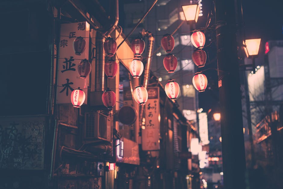
Environmental Context: Some locations are defined by their color palette. The pastel buildings of Miami, the earth tones of Santa Fe, the neon assault of Tokyo's Shibuya—removing color removes essential location identity.
Subtle Narratives: Color can tell subtle stories—the single red coat in a sea of gray commuters, the matching outfits of a couple, the faded colors of poverty versus the bright colors of wealth. These narratives disappear in monochrome.
Technical Foundations for Black and White
Shooting Considerations: While you can convert any color image to black and white, images shot with monochrome in mind typically work better. When shooting for black and white, focus on tonal relationships rather than color relationships. Look for contrast, texture, and form.
RAW Advantage: Always shoot RAW for maximum conversion flexibility. RAW files contain far more tonal information than JPEGs, allowing nuanced conversions that reveal subtle gradations invisible in compressed files. The extra data becomes crucial when pushing contrast or recovering shadow detail.
Exposure Strategy: Expose for highlights when planning black and white conversion. You can lift shadows significantly in post, but blown highlights remain blown. This approach differs from color photography, where balanced exposure might be preferred.
ISO Performance: Higher ISOs that produce unacceptable color noise often work beautifully in black and white, where noise becomes grain, adding character rather than detracting from quality. This extends your shooting envelope in challenging light.
Filter Effects: Understanding how color filters affect black and white conversion helps even in digital photography. Red filters darken skies and lighten skin. Yellow filters provide subtle contrast. Green filters lighten foliage. These principles guide digital channel mixing.
The Digital Darkroom: Conversion Techniques
Channel Mixing: Don't rely on simple desaturation. Use channel mixer adjustments to control how different colors translate to gray tones. Lightening reds while darkening blues can dramatically change portrait rendering. Understanding channel relationships provides precise tonal control.
Tonal Adjustments: Black and white images often benefit from more aggressive processing than color images can tolerate. Don't fear deep blacks and bright whites—the full tonal range gives monochrome images their power. However, maintain some detail in extremes to avoid flat, poster-like effects.
Local Adjustments: Use graduated filters, radial filters, and masking to enhance specific areas. Darkening skies, lightening faces, or adding subtle vignettes guides viewer attention more naturally than global adjustments alone.
Contrast Control: Master the interplay between global and local contrast. Overall contrast sets mood—high for drama, low for subtlety. Local contrast enhances details and separation. The balance between these creates your signature style.
Grain Addition: Digital sensors produce noise, not grain. Adding film-like grain in post creates organic texture that enhances the photographic quality of digital captures. Match grain size and intensity to your subject matter—fine for portraits, coarse for gritty street scenes.
Developing Your Monochrome Vision
See in Black and White: Train yourself to pre-visualize monochrome while shooting. Squint to reduce color perception and enhance tonal relationships. Some photographers set their camera's electronic viewfinder to monochrome while capturing RAW files in color.
Study Tonal Relationships: Before pressing the shutter, evaluate the scene's tonal structure. Will the subject separate from the background? Do highlights and shadows create the desired mood? This analysis becomes instinctive with practice.
Embrace Contrast: Black and white thrives on contrast—not just tonal contrast but conceptual contrast. Old versus young, smooth versus textured, light versus dark. These juxtapositions gain power when color doesn't compete for attention.
Find Your Style: Black and white encompasses vast aesthetic territory. From Ansel Adams' full tonal range to Daido Moriyama's crushed blacks, from subtle grays to stark contrast—experiment to discover your voice within the monochrome spectrum.
Project Consistency: When working on series or projects, maintain consistent processing. This doesn't mean identical—rather, a cohesive approach that unifies disparate images into a coherent body of work.
Master Studies: Learning from the Greats
Henri Cartier-Bresson: The master of decisive moments used black and white to focus entirely on geometry, timing, and human behavior. His images demonstrate how monochrome emphasizes compositional relationships and gestural dynamics.
Daido Moriyama: High contrast, grain, and blur characterize Moriyama's visceral approach. He proves that technical "imperfection" can enhance emotional impact when aligned with artistic vision.
Fan Ho: The Hong Kong master used light and shadow like a painter, creating minimalist compositions where darkness becomes as important as light. His work teaches the power of negative space in monochrome.
Vivian Maier: Her posthumously discovered work shows how black and white captures personality and social dynamics. The absence of color forces focus on expression, gesture, and environmental context.
Josef Koudelka: His high-contrast, geometrically complex images demonstrate black and white's ability to create order from chaos. Multiple layers of activity resolve into comprehensible compositions through careful tonal management.
Study these masters not to imitate but to understand their decision-making. Why did they choose black and white? How did they use its characteristics to support their vision?
Common Black and White Mistakes
Overdoing Contrast: The most common error is pushing contrast too far, creating harsh, detail-less images. While strong contrast can be effective, maintain subtle gradations that give images depth and dimension.
Ignoring Color Relationships: Just because you're converting to black and white doesn't mean color relationships don't matter during capture. Red and green might have similar tonal values, causing subjects to merge with backgrounds after conversion.
Neglecting Middle Grays: Drama lives in extremes, but beauty often resides in middle tones. Pure black and white with no gray creates graphic impact but can feel hollow. Rich middle tones add sophistication and viewing pleasure.
Converting Everything: Not every image improves in black and white. If removing color removes essential information or emotional impact, honor the image's colorful nature. Forced conversions rarely succeed.
Inconsistent Processing: Jumping between processing styles within a project creates visual discord. While individual images might excel, the collection suffers from lack of cohesion. Develop and maintain consistent aesthetic approaches.
Advanced Monochrome Techniques
Split Toning: Adding subtle color to highlights and shadows creates depth and mood. Warm highlights with cool shadows evoke vintage feelings. Cool highlights with warm shadows create modern, edgy atmospheres. Use sparingly—the effect should be felt, not seen.
Zone System Digital: Adapt Ansel Adams' zone system to digital capture. Pre-visualize where tones will fall and adjust exposure accordingly. This systematic approach ensures consistent, predictable results.
Luminosity Masking: Create precise selections based on tonal values for targeted adjustments. This technique allows natural-looking enhancements that respect original tonal relationships while optimizing local contrast.
Film Emulation: Understanding how different films rendered tones helps create authentic-looking digital conversions. Tri-X's gradual highlights, HP5's midtone character, T-Max's sharp grain—each provides inspiration for digital processing.
Hybrid Workflows: Some photographers shoot film for texture and scan for flexibility. Others apply film-inspired processing to digital captures. These hybrid approaches combine analog soul with digital convenience.
Black and White Street Photography Workflow
Preparation: Set camera to shoot RAW+JPEG with monochrome JPEG preview. This allows black and white visualization while capturing full color data. Review images on camera in monochrome to assess tonal relationships immediately.
Shooting: Focus on light quality, shadows, textures, and expressions. Ignore seductive colors that won't translate to powerful grays. Seek scenes with strong tonal separation and emotional content that transcends chromatic appeal.
Initial Review: Assess images in both color and black and white. Some surprises emerge—images weak in color might sing in monochrome, while colorful winners might fall flat without their chromatic appeal.
Processing: Start with neutral conversions to evaluate potential. Push processing further than color allows—black and white tolerates and often requires more aggressive adjustments. Save processing presets for consistency across projects.
Output Considerations: Different media require different approaches. Screen viewing favors higher contrast than prints. Newsprint needs different processing than gallery prints. Adjust final output accordingly while maintaining your vision.
The Emotional Psychology of Monochrome
Black and white photography connects with viewers on primal levels. Without color's cultural and personal associations, images communicate through more universal languages—shape, form, light, gesture. This direct communication often creates stronger emotional responses.
The absence of color also demands more from viewers. They must engage actively, filling in missing chromatic information with imagination. This participation creates deeper connections between viewer and image, making the experience more personal and memorable.
Monochrome's association with photography's history adds gravitas. Black and white images inherit the weight of documentary tradition, the authority of photojournalism, the artistry of master photographers. This cultural inheritance influences how viewers perceive and value monochrome work.
Building a Monochrome Project
Conceptual Unity: Black and white naturally unifies disparate images through consistent treatment. Use this to create cohesive projects from varied locations, times, or subjects. The monochrome treatment becomes the thread connecting diverse elements.
Emotional Arc: Structure projects to create emotional journeys. Start with establishing shots, build tension through contrast and drama, provide breathing room with subtle images, crescendo with powerful statements. Monochrome's emotional directness supports narrative development.
Technical Consistency: Maintain consistent processing within projects. This doesn't mean identical treatment—vary contrast and tone for individual image needs—but keep overall aesthetic approach unified. Viewers should feel images belong together.
Presentation Formats: Consider how monochrome projects will be presented. Gallery walls? Photo books? Online galleries? Each medium has unique requirements that influence processing decisions. Plan output from project inception.
Artist Statement: Articulate why you chose black and white for your project. This clarity helps during shooting and editing while providing context for viewers. The choice should feel inevitable, not arbitrary.
The Digital Age Advantage
Modern digital tools provide unprecedented control over black and white conversion. What required careful film choice, filter selection, and darkroom mastery now happens with precise, reversible adjustments. This freedom allows more experimentation and refinement.
Yet this power brings responsibility. The ease of conversion tempts photographers to decide after capture rather than visualizing before shooting. The most powerful black and white images still come from photographers who see monochromatically while shooting, using post-processing to realize pre-visualized intentions.
Digital's immediate feedback accelerates learning. See results instantly, adjust approach, and refine vision in real-time. What took years to master through film and darkroom work now compresses into months of dedicated digital practice.
Your Black and White Journey
Mastering black and white street photography isn't about learning techniques—it's about developing vision. Technical skills support artistic intentions but never replace them. The choice between color and black and white should serve your story, not follow trends or habits.
Start by spending a month shooting exclusively for black and white. Don't just convert color images—actively seek scenes that will excel in monochrome. Look for light, shadow, texture, and emotion. Train your eye to see tonally rather than chromatically.
Study masters but develop your own voice. Maybe you prefer subtle tones or stark contrast. Perhaps grain enhances your vision or clarity better serves your stories. These preferences emerge through practice and honest self-assessment.
Remember that black and white isn't better or worse than color—it's different. Each serves specific purposes, tells certain stories, evokes particular emotions. Master both, but know when to deploy each for maximum impact.
The streets offer endless opportunities for powerful black and white photography. Every play of light and shadow, every textured surface, every emotional moment provides raw material for monochrome magic. The question isn't whether to shoot black and white, but when its unique characteristics best serve your vision.
Strip away color's seduction. Embrace the essential. Let black and white reveal truths that color conceals. The streets are waiting, and they've never looked more dramatic than through monochrome eyes.
---
Ready to explore the power of black and white street photography? Share your monochrome vision with our community at InTheStreets and discover how others are using this timeless medium to capture contemporary life.
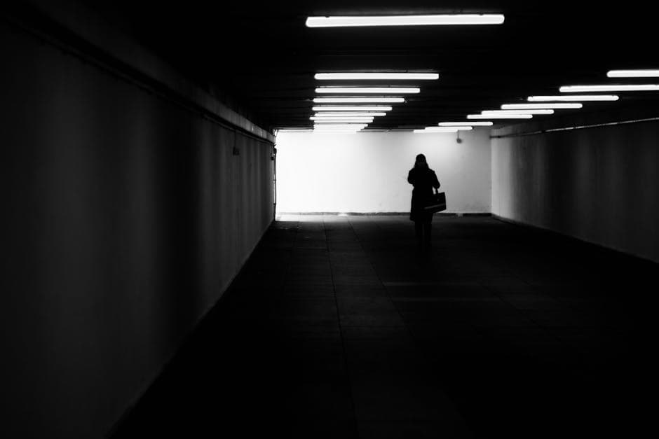
*Featured image: "Silhouette walking in underpass" by Ivanov Vladimir via Pexels*